Tranztec Mobile is the driver-facing app in the Tranztec logistics ecosystem. It's how drivers, usually working for mid-size trucking companies, see their assigned trips, navigate between stops, complete dispatch documentation, and message with dispatch. It's the app that sits in the cab.
I designed it on top of the Tranztec UI Kit's in-cab density, which meant a lot of the interaction-safety work was already baked in at the token level. My job was to design an app that respected what a driver's day actually looks like: hours on the road, hands often on the wheel, attention almost entirely on driving, with the app filling the narrow gaps in between.
My role
Sole designer, end-to-end. I worked with a PM, SMEs and a dev team to ship it.
Early in the project, I asked to talk to actual drivers. The company wasn't great about connecting designers to users, so I found one myself, the husband of a coworker, a working driver, willing to talk.
He didn't love the apps he was forced to use. I won't claim to have a perfect quote; I lost track of it, but the substance was clear. These apps were built by people who didn't understand the job. Too many taps. Too much was asked of him at exactly the wrong moments. Information was buried where he couldn't find it when he needed it. From his perspective, he just needed to know what he had to do next. Everything else was a distraction until he actually needed stop information.
That conversation became the design brief. Not the official one. The official one was a long list of features and stakeholder requirements. The real one was simpler: build an app a driver doesn't hate.
The interview surfaced a clear list of priorities. A few of them, unfortunately, were out of scope from a dev perspective. Most notably, the app couldn't ship with maps. Our company had been close to signing with a TomTom-type mapping partner, but the service got deprecated before the contract closed. After that, there was no clear direction for a replacement.
I committed fully to a list-first design. Not because lists are better than maps for this category, they're not, but because waiting on a mapping partner that might never arrive wasn't a plan. The constraint shaped the entire information architecture. If I couldn't show drivers where they were going on a map, I had to be exceptional at showing them what they were going to do, in order, with zero ambiguity.
That constraint turned out to be productive. It forced the central design idea of the app.
"Can the driver do this with as few taps as possible, with as little reading as possible, at exactly the moment they need it?"
Drivers don't browse apps. They glance. They tap once or twice between gear shifts. They put the phone down the second something needs their attention on the road. An app that asks more of them than that is an app they'll resent. A dispatcher who can't get documentation back from the field is a dispatcher who calls, which is the thing the driver hates even more.
The whole app is built around making the next required action the most obvious thing on screen, at all times.
The core interaction model is borrowed from music apps.
In Spotify or Apple Music, the song you're listening to lives in a persistent mini-player above the tab bar. You can browse your library, search for new music, dig into a playlist, but the thing you're currently doing never leaves the screen. One tap brings it back to full size.
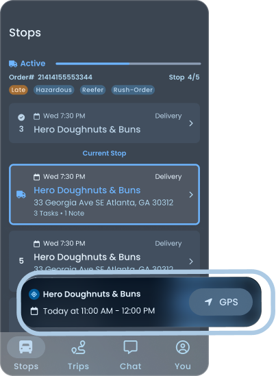
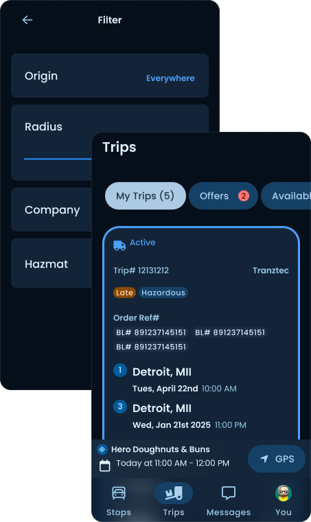
I applied the same pattern to stops. The driver's current stop sits in a persistent card above the nav bar, visible from every screen in the app. They can be on the Stops list, Trips screen, Messages, or their profile, and the next thing they need to do is always one tap away.
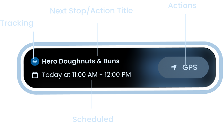
Anatomy
Swipe to see the full card
Persistent utility
Always visible
The next stop's name and time. Glanceable. No tap required.
GPS handoff
A button that hands off to their preferred navigation app.
Late
If the driver is projected to arrive late, the time and background shift to a warning tint. No copy needed.
Flexible
The card fits any action, non-stops, starting a trip, finishing tasks after a trip, going back to complete something unfinished.
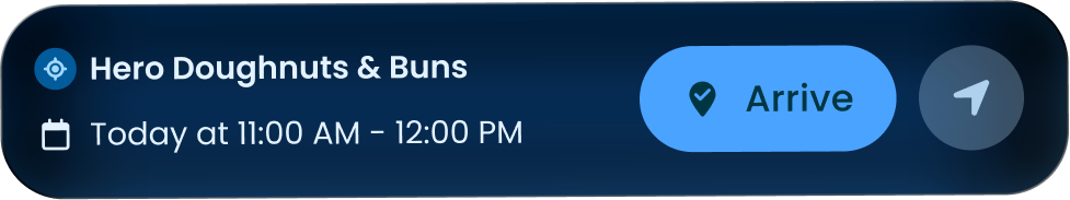
A card for every state
Arrived
Swipe
If the driver has location services on, they can mark arrival directly from the card.
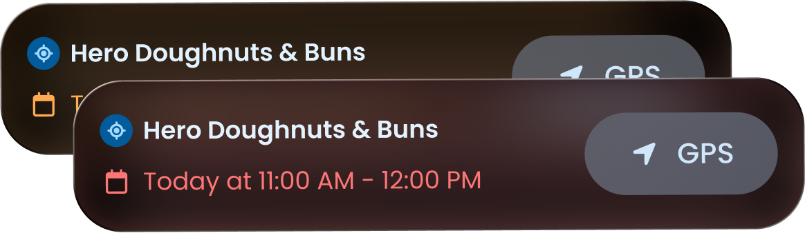
Late
Swipe
Warning tint. The driver knows immediately, without reading a sentence.
All states, through the day
Swipe to see every state
Tapping the stop card is the equivalent of expanding the mini-player.
This is the single design decision the rest of the app rests on. It's also the thing I'm proudest of. A simple idea, but it directly answers the driver's complaint that information was always buried.
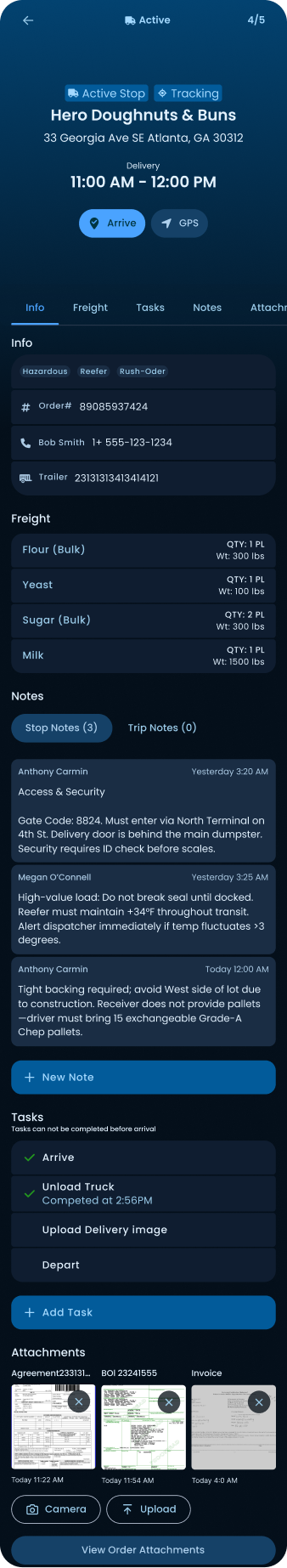
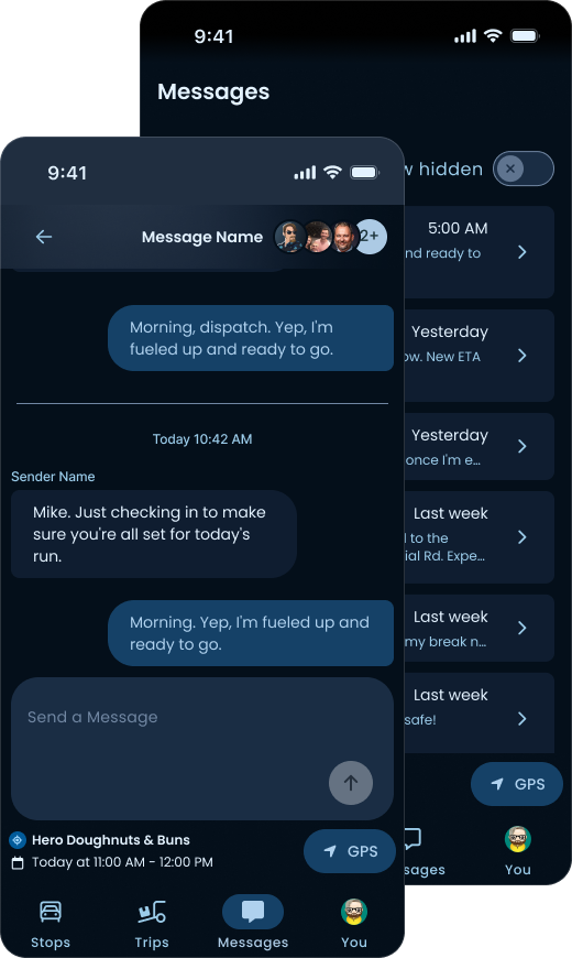
The stop detail screen is where a driver works. Everything they need for the current job lives here: contact info, freight specs, notes from dispatch, attachments like the BOL, and the tasks they need to complete on arrival. It's the one screen in the app a driver might genuinely spend time on, so it had to earn that time.
Active Stop · Hero Doughnuts & Buns
Identity at the top. Stop status, name, address, delivery window, and the two primary actions: Arrive and GPS. A driver pulling up to the lot should be able to confirm they're at the right place and tap Arrive without scrolling.
Tabs for the rest. Info, Freight, Notes, Tasks. Each is one tap away. The most-glanced-at content, reference numbers, contact, trailer, lives on Info as the default tab.
Notes with context. Dispatch notes are timestamped and attributed, so the driver can see who said what and when. Gate codes update, contacts shift, the driver needs to trust the most recent note over the older note. Attribution makes that clear.
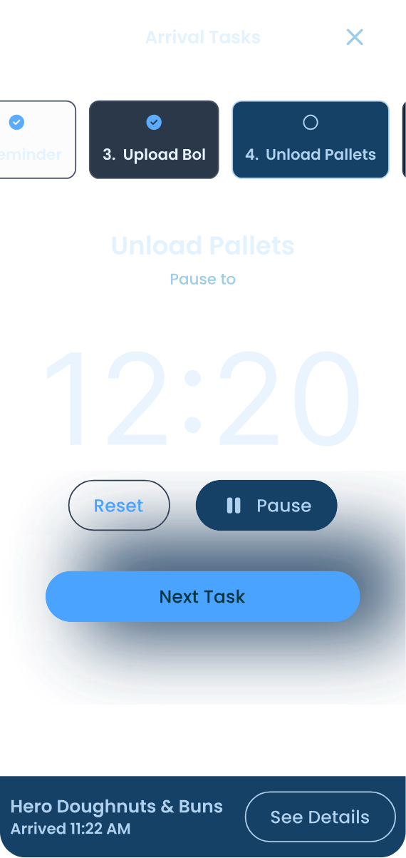
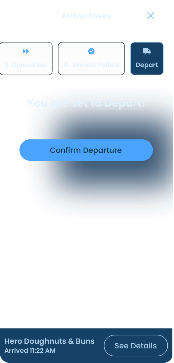
Tasks with state. Completed tasks show timestamps. Pending tasks show what's still required. A footnote, "Tasks cannot be completed before arrival", quietly enforces the workflow without nagging the driver with errors.
Attachments as thumbnails. BOLs, agreements, invoices. Visible as preview tiles, openable with one tap, with Camera and Upload buttons for adding more.
Works across TMS scopes. Tranztec integrates with several different TMS platforms, and they don't all behave the same way, some dispatchers attach to the trip level, others to the stop level. Either way, the driver finds what they need here. They never have to know how their dispatcher chose to file something.
Identity at the top. Stop status, name, address, delivery window, and the two primary actions: Arrive and GPS. A driver pulling up to the lot should be able to confirm they’re at the right place and tap Arrive without scrolling.
Tabs for the rest. Info, Freight, Notes, Tasks. Each is one tap away. The most-glanced-at content, reference numbers, contact, trailer, lives on Info as the default tab.
Notes with context. Dispatch notes are timestamped and attributed, so the driver can see who said what and when. Gate codes update, contacts shift, the driver needs to trust the most recent note. Attribution makes that clear.
Tasks with state. Completed tasks show timestamps. Pending tasks show what’s still required. A footnote, “Tasks cannot be completed before arrival”, quietly enforces the workflow without nagging the driver with errors.
Attachments as thumbnails. BOLs, agreements, invoices. Visible as preview tiles, openable with one tap, with Camera and Upload buttons for adding more.
Works across TMS scopes. Some dispatchers attach to the trip level, others to the stop level. Either way, the driver finds what they need here, they never have to know how their dispatcher chose to file something.
The whole flow is designed to be linear because the driver shouldn't have to think about what comes next.
Each screen has one obvious primary action, sized for in-cab tapping, with the rest of the UI quieted down. The persistent card at the bottom continues to anchor them in the larger journey.
Tap a step to walk the screen through it, or let it run.
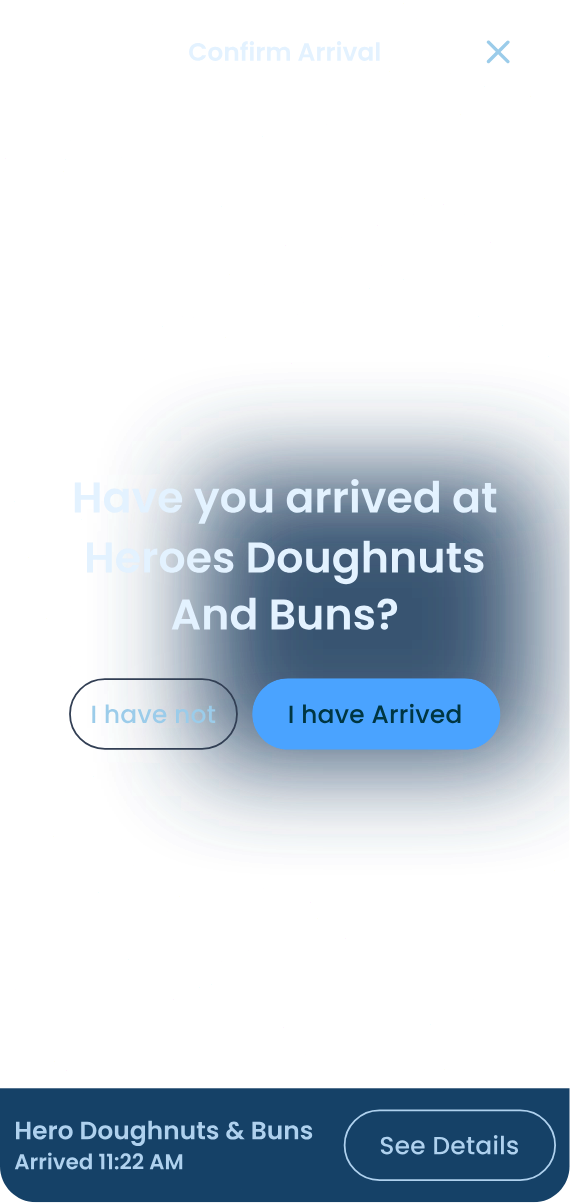
Confirm arrival
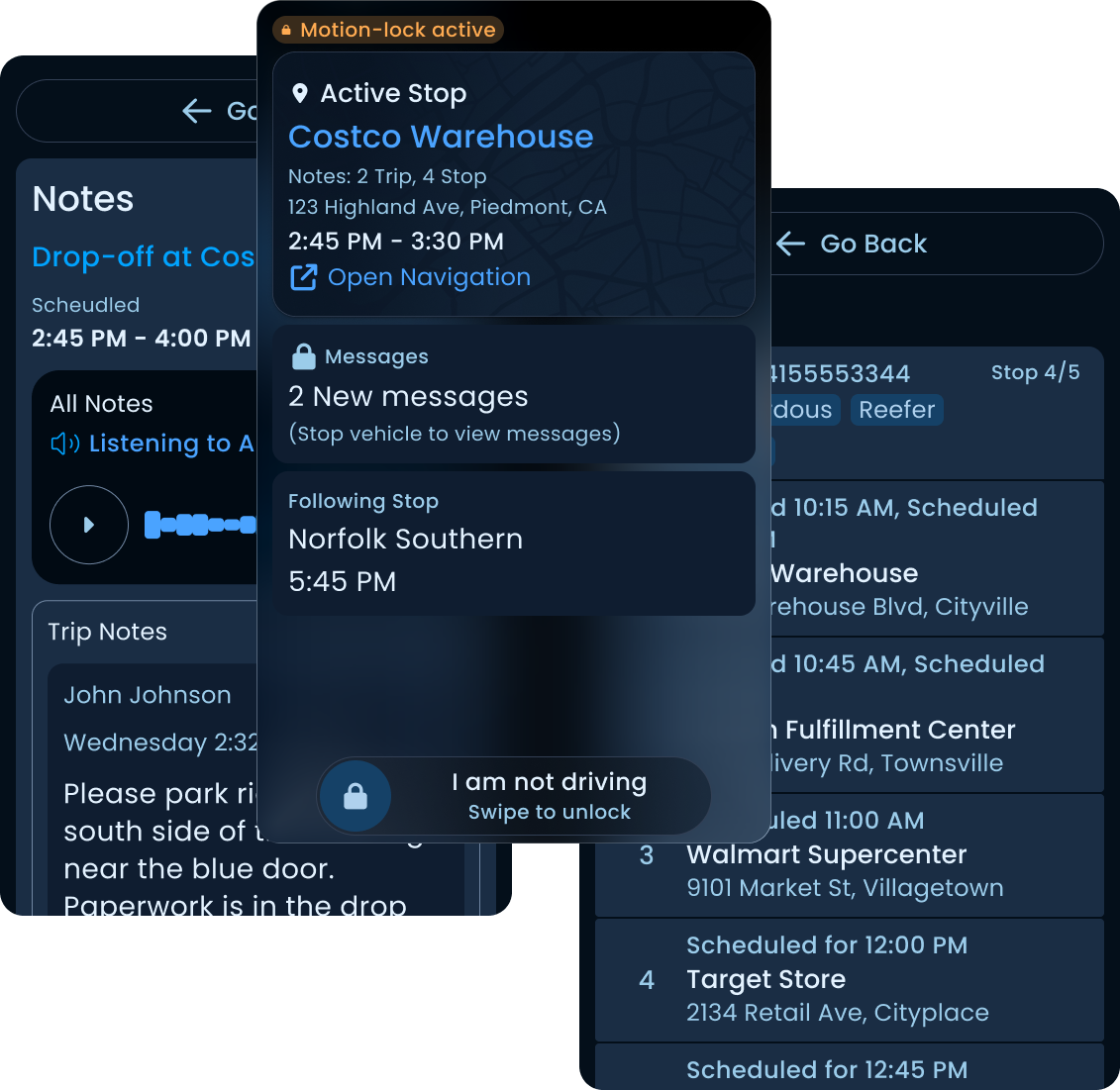
When the truck is in motion, the UI strips down to almost nothing.
The driver sees whether the upcoming stop has notes, tasks, or messages waiting, so they know what they'll need to deal with when they pull over, but they can't open any of it. They get one button to open their preferred navigation app, and a swipe-to-confirm control to mark themselves as not driving in case the motion trigger fired in a passenger context. That's it. One tap target, one deliberate gesture, zero distractions.
Swipe-to-confirm control · deliberate gesture
The swipe is intentional. A tap is too easy to fire accidentally, a phone resting in a cupholder, a sleeve brushing the screen, a passenger picking it up to look at something. Marking yourself as "not driving" while you're actually driving is a regulatory and safety problem, not just a UX one. The swipe makes the action deliberate enough that it can't happen by accident, but light enough that a real passenger can complete it without friction.
The trigger thresholds are aligned with how telematics platforms like Geotab handle motion detection. We were intentionally conservative. Hours of Service regulations touch this kind of logic, and a loose trigger would be a liability.
Driver lock mode isn't a separate set of components. It's the same components, configured for the most demanding context they have to support.
Swipe-to-confirm control · deliberate gesture
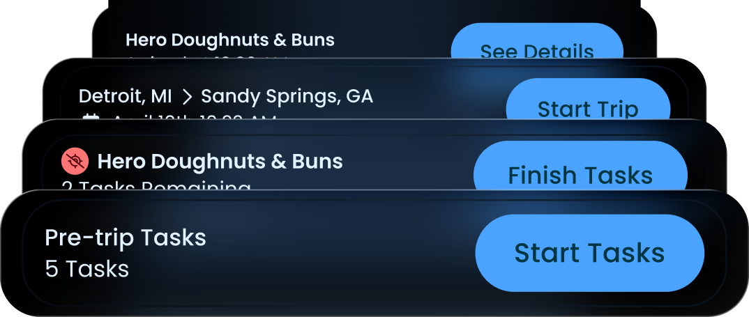
A few other surfaces worth calling out.
Click any screen to explore, or let it run.
Tap a surface to switch
Two things, if I were starting over.
Map-first IA and HOS
The list-first design was the right call given the mapping constraint, but it wasn't the right final answer. A driver's mental model of a route is spatial. A map is the natural birds-eye view of a day's work. If I were doing this again with mapping resolved, I'd lead with a map view and let the list be a secondary surface, not the other way around.
Hours of Service belongs in this redesign too. Right now the app knows when the truck is in motion, but it doesn't know how that fits into a driver's legal drive time for the day. A proper HOS integration would surface remaining drive hours and required break windows directly in the route view, so the driver can see at a glance whether the next stop is reachable before they're forced to pull over. That's the kind of context that makes the difference between an app a driver tolerates and an app that actually helps them do their job.
AI for hands-free
The driver's biggest complaint was that information was always asked of him at the wrong moment. A version of this app that could read notes and messages aloud while the truck is in motion, and let the driver respond by voice, would close the last gap. The hardware can do it. The regulatory environment supports it. It was out of scope at the time, but it's the obvious next layer.
The app was about to ship when I left Tranztec. I don't have post-launch metrics or driver feedback to share. What I have is a design that survived stakeholder review, SME review, and engineering scoping, built around a single guiding principle that came directly from interviews.
Tranztec EDI
A dense, line-heavy EDI mapping tool, made calm and readable. The one request: "Please, no lines."
 © 2026 Anthony Carmine Pietramala